Bridgemead’s new branding is revealed today. We needed to refresh our image after 25 years and want our new logo to reflect, in a modern way, some of the best things about Bridgemead. We asked our staff and others to say what Bridgemead means to them. Main themes were:
-
- Caring
- Family
- Community
- Homely
- Inclusive
- River setting
- Environment (trees,wild life, etc)
- Location near Cleveland Bridge
- Good food.
A logo was designed by Mytton Williams based on this research and incorporating the reliefs on Cleveland Bridge.
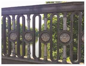
The symbol from the bridge is shown in two colours: the bridge and its reflection in the river. The colour for the bridge was selected to represent the environment (trees, foliage, etc). The whole image symbolises a community setting, people gathered together in a circle, eating together or enjoying friendship, all of which which we feel are at the heart of Bridgemead.